With Simple Design
These are the things I love.
Wednesday, 21 September 2011
Burnt Wood Siding - shou-sugi-ban
Shou-sugi-ban, or burnt wood siding is a traditional Japanese method for charring cypress boards to use as siding. It is known to last over 80 years and is a natural protectant against fires. The process is quite simple and the result is bold and beautiful.
Monday, 12 September 2011
Emigration Canyon Residence, designed by Sparano + Mooney Architecture is a single family dwelling located near Salt Lake City, Utah. The 2,500 SF house has earned the first LEED Silver green home certification showing just how beautiful sustainable design can be. Filled with views of the canyon, this home boasts a 30-foot operable glass wall and plenty of open space for entertaining. The choice of recycled steel shingles in a quilt-like pattern creates interest and compliments the warm colors of the canyon.
Friday, 9 September 2011
Thursday, 8 September 2011
Sweet Retreat
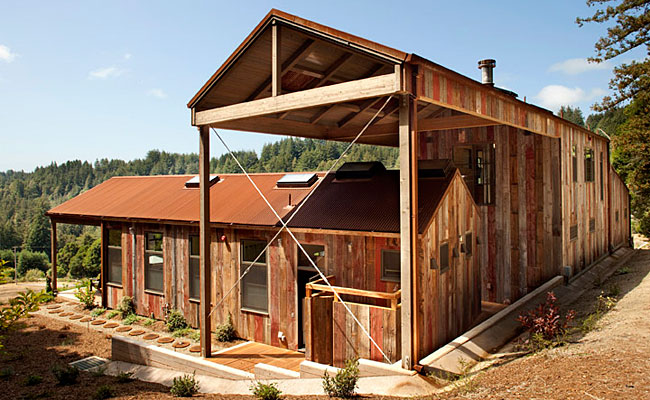
This Aptos California retreat was designed by CCS Architecture for a large, busy family. It consists of two main buildings that overlap, one for sleeping and one for living. A separate barn for games and activities sits near by along with a swimming pool, archery range, and two small guest cabins. I love the use of reclaimed barn boards and rusted steel on the exterior. A wall of sliding glass doors makes for ideal indoor-outdoor living with views of the ocean in the distance. Cozy and carefree, I imagine all your worries go away once you step foot into this California getaway.
Wednesday, 7 September 2011
Bright Ideas
I've been asked to design a 4' in diameter pendant for work and need a little inspiration.
First is this beauty of a pendant, the Delta IV by Rich Brilliant Willing. To me this light is a perfect balance between bold and soft with the gold lining just peaking through.
Restoration Hardware's Filament Chandelier has been a long time favorite of mine. Its simple design has an ghost-like quality to it.
The Giogali Chandelier from Design Within Reach is what hung over my kitchen table for a long time. The individually hand-blown glass pieces make for a one-of-a-kind fixture, that gives off a very elegant light.
This is the Corona Pendant designed by Jose Solis Betancourt for Holly Hunt. Perfect for over that kitchen island or peninsula.
For my final selection I chose Hammerton's CH2133 Chandelier. It has a medieval feel to it that could bring some drama to any space.
Enjoy your day!
You can find more information on each light below:
Tuesday, 6 September 2011
Book Talk
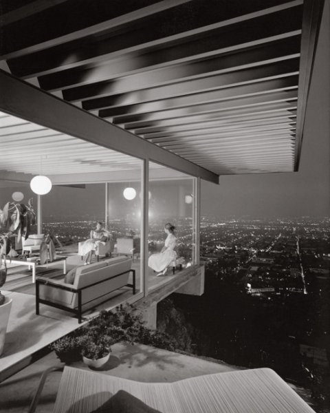
My latest book purchase was Case Study Houses: The Complete CSH Program 1945-1966 by Julius Shulman, Elizabeth A. T. Smith, and Peter Gossel. If you don't already own this book go buy it now. It's big, heavy, and full of quintessentially mid-century modern design. The Case Study House Program was launched in California in 1945 through Arts & Architecture Magazine. 36 homes were designed by various architects, the point being to have modern homes that could be inexpensively and easily constructed to fulfill the post-war housing boom. Some were built and some were not, here you will find all of them. Included are the original concept drawings, blueprints, and models along with stunning photography of the ones that did see the light of day. It's a great coffee table/conversational piece, with designs by Charles and Ray Eames, Eero Saarinen, and Richard Neutra among many others.
For more information on this book and a lot of other great architecture and design books check out the Taschen website.
Number One
All right, so here is my first blog post. I am not sure what direction my posts will go in, but you can be sure that it will be centered around architecture and design, with a particular emphasis on mid-century modernism. I am a big fan. My father is a designer and the person I blame on my constant loving and critiquing of everything around me. He has also instilled in me a love of raw, natural materials, simple and beautiful things that exist without any help from us humans. I am not much of a writer (as I’m sure you’ve noticed) I work better with pictures than words. And on that note, the inspiration for my first post will be something my dad always tells me, whenever you have a flaw, an eye sore, or an obstacle that you can’t get rid of, figure out a way to turn it into a feature. Enjoy.
Halifax’s own MacKay-Lyons Sweetapple Architects designed the Kutcher house around a very obvious obstacle – a giant granite boulder protruding from the ground. Having the house ever so gently sitting atop turns the rock into an extension of the house making it part of the architecture rather than trying to disguise it or all together get rid of it. I love that the homeowners use it as their patio with two classic adirondack chairs painted in cheerful colors.
The kitchen, housing a 21' long island, and living room faces out towards the water with floor to ceiling windows and doors for easy access to the boulder. A good place to have your morning coffee while you watch the ships go by.
I'll leave you with a picture of the staircase. I have an obsession with staircases and this one is no exception. Its steel construction provides stability and structure to the house as well as a means to get from one level to the next.
Labels:
Architecture,
Costal,
Nova Scotia,
Residential,
stairs
Subscribe to:
Comments (Atom)


